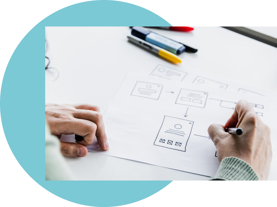
How to design inclusively?
Inclusive design principles
Follow inclusive design principles
Craft your digital building logbooks using comprehensive inclusive design guidelines. Address accessibility, usability, and diversity considerations to ensure a platform that genuinely accommodates the varied needs of homeowners and other stakeholders across Europe.
Infuse your logbook with universal design features for broad accessibility. Take inspiration from successful examples in other platforms to create a logbook that caters to a diverse user base.


Prioritise intuitive design
Create a user-friendly dashboard offering a customisable overview of the digital logbook. Implement inclusive data visualisation and navigation controls, empowering homeowners to efficiently manage and explore their building information.
Design accessible forms and input controls for entry and editing screens. Provide clear guidance for error handling and user feedback, minimising frustration and ensuring a seamless interaction for all homeowners.
Validate early and often
Validating designs through organising user tests in an early phase with real homeowners or other target audiences is crucial for building logbooks that resonate. It ensures user satisfaction, identifies potential issues, and aligns the platform with diverse needs. Early validation saves time and resources, resulting in a more inclusive and successful implementation later on.

Did you know?
When it comes to digital skills and access in Belgium, 5 factors play an important role in determining the risk of digital exclusion: income, education, age, family composition, country of birth
Source: Mediawijs.be
32%
of Europeans still lack basic digital skills
>90%
jobs in Europe require basic digital knowledge alongside traditional skills like literacy and numeracy
Inclusive design principles
Be consistent
You should say the same things in the same way and users should be able to do the same things in the same way.
Example: Consistent design patterns Use consistent web and platform design patterns to help build familiarity and understanding. Always keep core elements like navigation, news, notification in the same patterns.
Give control
Do not suppress or disable the ability to change standard browser and platform settings such as orientation, font size, zoom, and contrast.
Example: Make it stop
Some users find animations or special effects distracting and annoying. If these animations and effects play automatically in a loop, it is important to make them stop by providing a prominent play/pause button.
Prioritise content
Interfaces can be difficult to understand when core features are not clearly exposed and prioritised.
Example: Keep task focused
Progressively reveal features and content when needed, not all in one go.